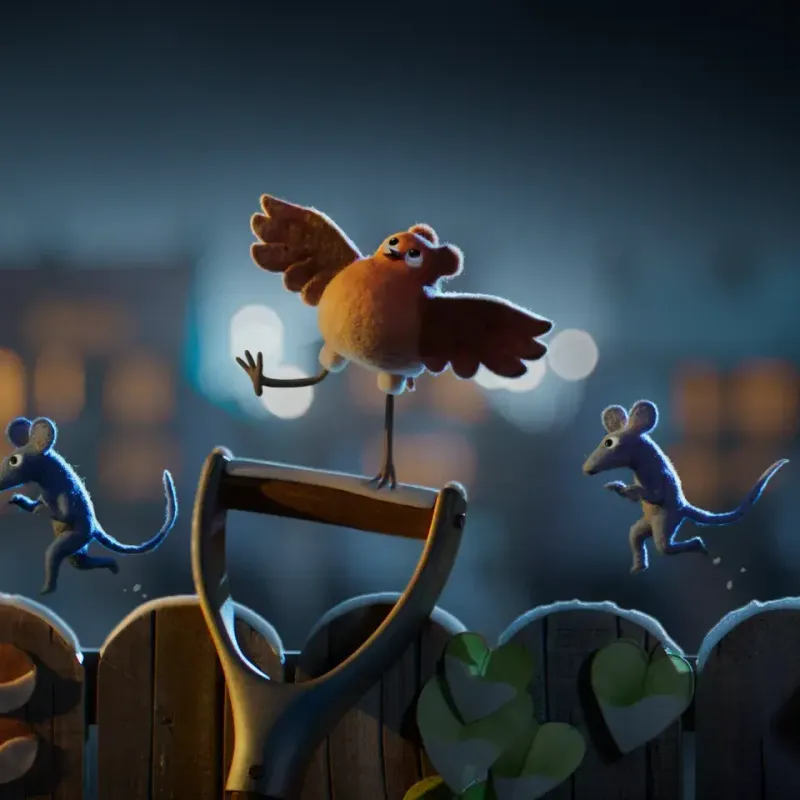
Meet Robin (the…well, robin)
client
Aardman
services
Brand Identity
Packaging
Style Guide
date
October 2021
She’s the red-breasted star of Netflix’s short film, Robin Robin – produced by Aardman and directed by Mikey Please and Dan Ojari.
When her egg fortuitously rolls into a rubbish dump, she’s raised by a loving family of burglar mice. As Robin grows up, her not-so-mousey ways become more apparent. In a bid to prove to her family that she can be one of them, she sets off on the heist to end all heists and ends up discovering who she really is.
Over to the ‘hoomans’
When Aardman approached us to take on the festive film’s brand identity, we couldn’t wait to get cracking (sorry).
The film already had a beautiful title treatment that everyone loved. But they needed something that worked for commercial purposes too – and wasn’t lifted straight out of Robin’s festive world of felt.
On the hunt…
Our mission? To find the golden egg – a brand identity that balanced the film’s beautiful illustrative production, 3D world of animation and many marketing needs.
By treating all brand identity as brand extension, you can open up a (felt-covered) world of possibilities. So rather than just focusing on the logo for streaming or packaging – we worked on developing an identity that could be used everywhere from app icons to billboards.

“The process of taking something already loved and making it new for a different audience meant gaining the trust of the directors by working sympathetically to the way they work and hand crafting everything”

Ticking the Netflix box
When it comes to family entertainment, it’s stiff competition. As a nuanced, crafted, illustrative film – we needed it to perform alongside shows that are loud, punchy, bombs of colour.
When creating any logo, there’s always the temptation to force it to convey everything: squeezing production design, characters and 90 minutes of narrative into a single icon. But that’s not possible (or desirable). A logo needs to be eye-catchingly simple – with no fiddly bits or second strap lines – to really stand out.
How we cracked it
After having the privilege of watching the film many months in advance, we then conducted a market overview, created concepts and started considering the brand identity as a whole.
By isolating beautiful details, like carefully crafted foliage, from the production design and simplifying them as much as possible then incorporating them into our work – the client could feel that there was still a strong connection to the production.
To give consumers a sense of continuity, we used the same processes that Aardman were using wherever possible – giving the work as much love, care and attention to detail as they had. The film itself is made by designers and artists that hero delicate, handcrafted detail, so all of our typography was hand-lettered too. Together with Aardman and the directors, we worked on a process of refinement and crafting, until…


Tah dah!
We delivered not just a single logo, but a suite of options they could use everywhere from book covers to billboards.
The end result? A brand identity that worked for the commercial needs of Netflix and the director’s desire for detail, bringing through the artistic craft of the film. Oh, and a project that was a real tweet (last one, promise) to work on.