Trusted with a national heritage
client
National Trust
services
Strategic Insight,
Packaging,
Communication
date
Launched 2020

For over 125 years, the National Trust has been the custodian of Britain’s spectacular landscapes, stately homes, and vibrant history. But all that heritage comes with a challenge. How can the National Trust extend its brand across various licensing opportunities without losing its values and identity?
For everyone,
for ever
More than just a nice turn of phrase, “For everyone, for ever” is the National Trust’s mission statement. It’s at the core of everything they do. And as lovely and honourable as that is, it brings with it a problem. Namely, if the National Trust means so much to so many different types of people, then translating that into a licensing programme is a mammoth undertaking.
In recent years, the Trust’s audience has grown younger and more diverse - thanks in part to engaging with different communities such as Parkrun and Sports England. On the other side of the Trust is the work they do with art organisations, tapping into yet another demographic. When Michaela, Brand Licensing Manager at the Trust, started in 2019,
the only assets in the style guide were photos of their landscapes and historic buildings. This lack of visual assets, combined with a disparate design system and an ever-growing audience, meant that the National Trust needed a coherent extension strategy. Without it, licensees and commercial partners had no guidance, and opportunities were being lost.
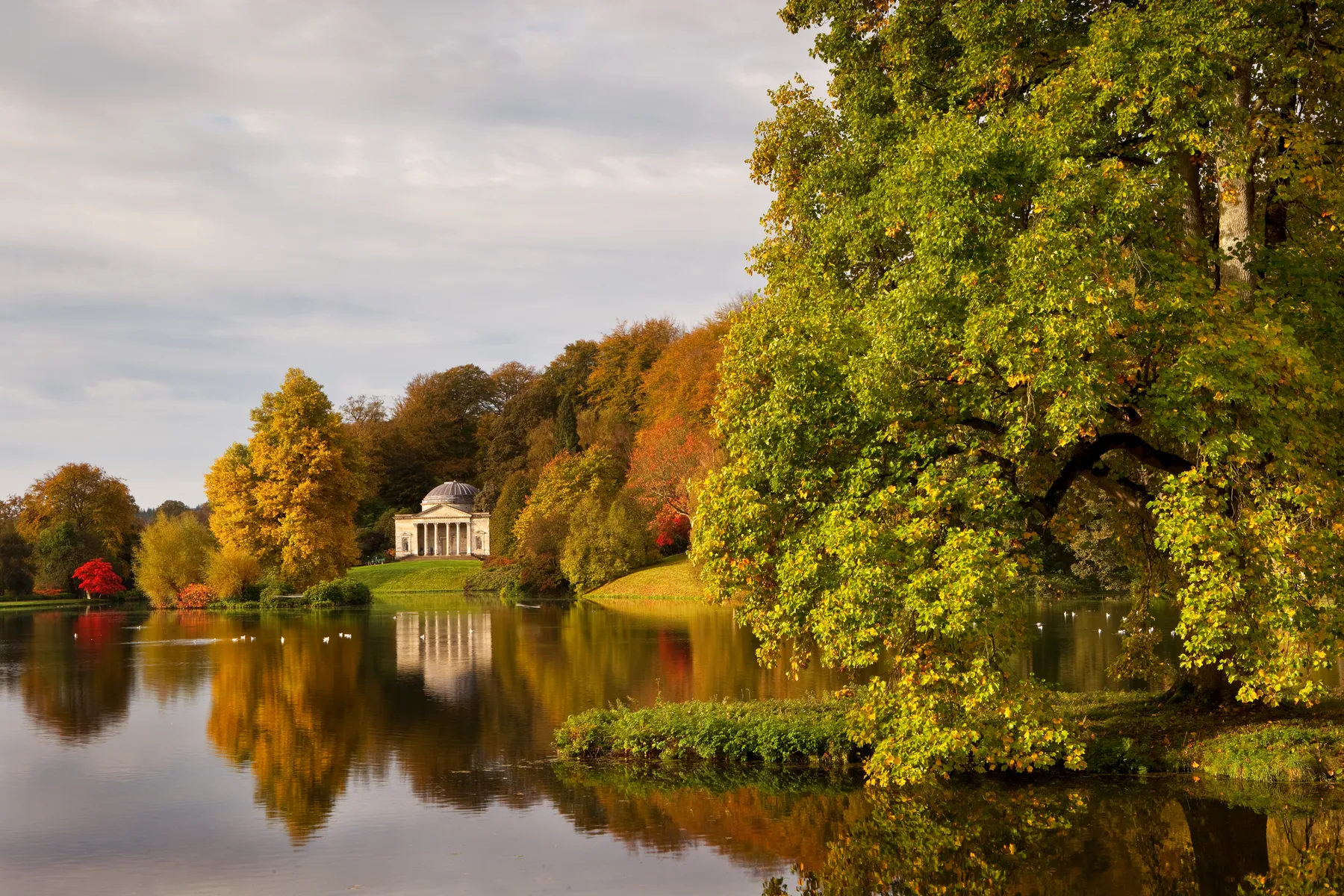
In with the old
Our first port of call was the strategy. We began by joining up the dots across all of the Trust’s visual and intangible - how people think and feel about the Trust - assets. We also segmented the Trust’s audience and market demographics, meaning we could address each individually and produce products that would resonate even more.Once we had a firm grasp of the old, we could look to the new, identifying relevant trends and incorporating them into the Trust’s new extension strategy.
But we had to tread carefully. The people involved with the Trust are extremely passionate about it, and so we had to honour the past and legacy as we moved it forward. That’s why the Trust’s core values and mission statement were so useful. By keeping them at the centre of any strategic thinking, we could make sure the Trust’s heart was never lost.

A taste of Britain
Before we started designing the Trust’s style guide and visual assets, we felt it important to immerse ourselves fully in its world. As well as spending some time in the head office and on-site, we also visited countless estates, woodlands, and parks, soaking in all they had to offer. This further instilled the sense of history that the Trust works so hard to protect, and inspired many of the final designs.
After being blown away by all that the Trust had to offer, we returned (a little sad to be leaving) to our desks and conducted further research into demographics and cultural perceptions. And slowly but surely several creative avenues presented themselves.
A natural fit
Taking
all of those ideas and refining them wasn’t an easy task, but after a
lot of iterating and testing various ideas we boiled it down to 6 core
themes. These themes showcase the breadth of beauty and eons of history
that the Trust watches over, all while staying true to their core value
of “for everyone, for ever”.
We
then took those themes and turned them into a style guide that the
Trust could use to inspire licensees and show them how they could
develop products that stay true to the Trust’s values. It was important
to keep it flexible, so partners could adapt it to different audiences
and product categories.

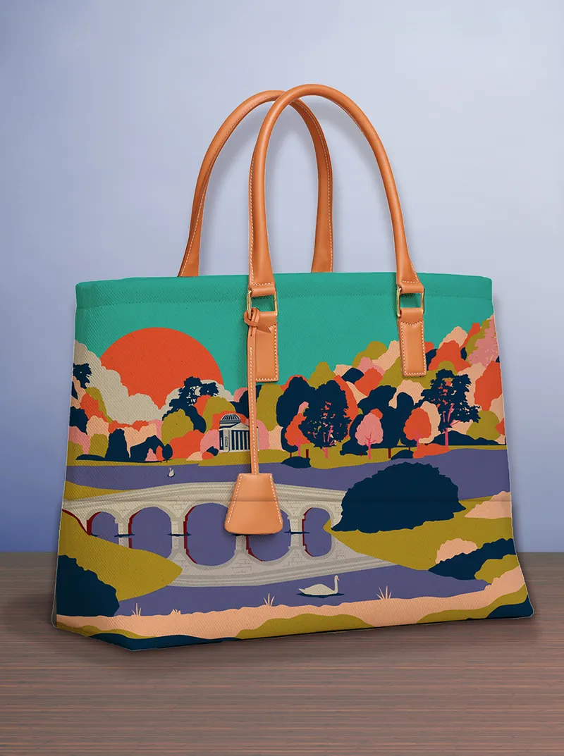




It means licensing partners and retailers understand how they can communicate the core values of the Trust whilst adapting the look and feel to their audience.
Not only that, but the Trust was nominated for many categories at the Brand & Lifestyle Licensing Awards.


The style guide has inspiring design assets but it also packaging, which is a big part of how we present our charity messaging.
— Michaela Davies, Brand Licensing Manager at National Trust


