Taking on the Time Lords | Doctor Who x Skew
TL:DR Skew collaborated with BBC Studios to refresh Doctor Who's packaging design across various product categories. By immersing themselves in Whovian culture and experimenting with iconic elements like the T.A.R.D.I.S., they created a cohesive packaging range. Skew produced a set of guidelines complete with technical production instructions balancing fan love and commercial appeal, earning praise from BBC Studios' Creative Director. ""
If there’s one TV show that has really stood the test of (space and) time, it’s Doctor Who. Since 1963, it’s been a British staple – and for over 10 years, we’ve been working with BBC Studios on the show’s packaging design and guidelines. So when the team came back to us last year for a new project, we already knew our way around the T.A.R.D.I.S.
The brief was an interesting one: they had just launched a brand new logo inspired by the 1973 series, so needed to refresh the packaging design and guidelines across three product categories – 'classic' (for all of the doctors throughout the years), 'special' (for one-off shows, like festive episodes) and 'anniversary' (created to mark the show’s 60th anniversary). As usual, our strategic approach meant that we started off by tapping into trend and market research – something that felt particularly important for a show with such a strong fanbase.
For every Whovian, everywhere
In case you’re wondering, Whovians are the fanbase in question – a bunch of passionate sci-fi fans that know and love every corner of the Whoniverse. So we took to the research stage with them in mind, immersing ourselves in all of the product ranges and exploring the market. By stepping into stores, we got a sense of which products really stood out on the shelves.
There were also some challenges to consider. The first was how to stand out in a crowded market and be instantly recognisable. The second was how to do all of this without incorporating images of the doctors. There was only one thing for it…
Back to the moodboard
With a hoard of Whovians to consider, we knew that whatever we did needed to be carefully thought through. By getting stuck into moodboarding, we could experiment with the key components we had to play with: the timeless T.A.R.D.I.S., the ever-changing vortex and the bold new logo. From there, we took those three elements and explored different creative approaches – balancing the need to stand out on the shelf with telling a story that would connect with the audience.
Geronimo! We cracked it
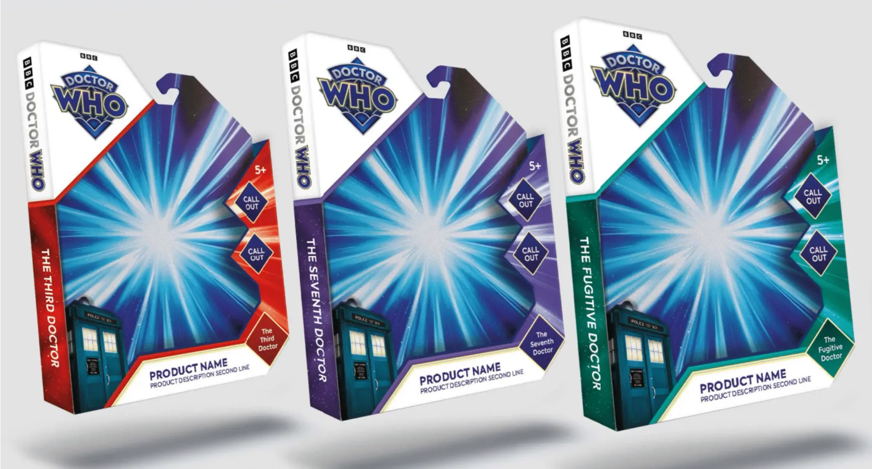
Eventually, we hit upon the answer: instead of three separate packaging ranges, we’d create one strong range that would feel instantly recognisable and cohesive. Built around each unique vortex with a fresh white background that allowed the new hero logo to shine, we created a format that could be flexed across the different categories.
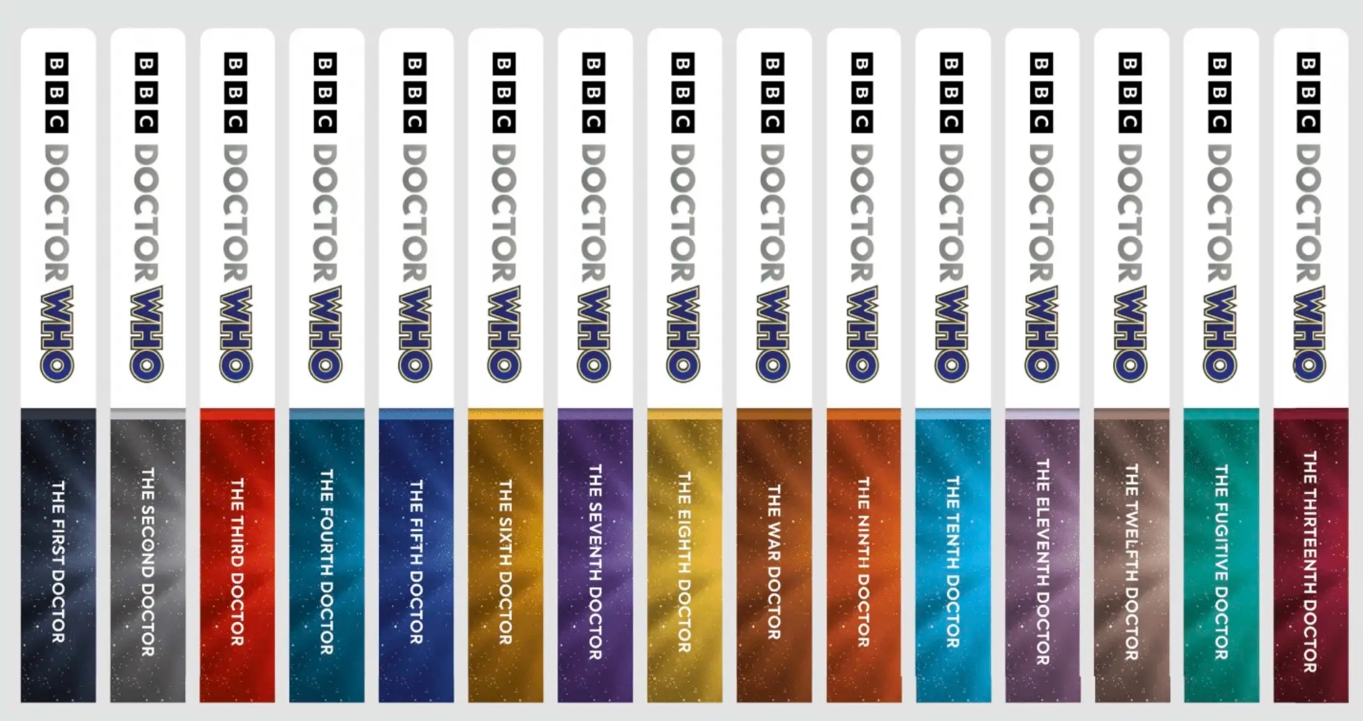
Then, within each range, we found ways to incorporate the small details that hold meaning for fans. For the ‘classic’ range, we introduced a collectable colour palette inspired by each series, with a different shade for each doctor. For the ‘anniversary’ range, we created a logo that echoed the ‘diamond’ 60th anniversary. For the ‘special’ range, we used a more vibrant, multi-coloured vortex that reflected those one-off episodes.
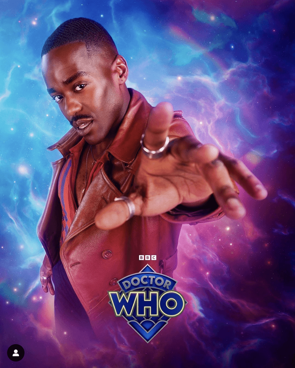
After a successful round of feedback, the BBC Studios team asked us to design the ‘current’ range too – for the brand new Doctor, Ncuti Gatwa. So we followed the same design principles and used the warm, orange tones of his vintage outfit as inspiration, creating a contrasting cooler blue and purple vortex for his range.
Another mission completed
The final result was a set of packaging guidelines that reflected the current market whilst staying true to the brand (and those all important fans). We wrapped them up into an easy one-stop-shop guide, including technical details for manufacturers. By balancing that love of detail and collectability for the fan base, with the kind of commercial impact that pops on a shop shelf, we created a set of designs and guidelines that tick every box.
Oh, and a thumbs up from David Wilson-Nunn, Creative Director at BBC Studios – who gave us a 10/10 NPS score and a glowing review:
‘The big challenge was to create a fresh, clean, and vibrant graphic solution that worked across both old and new seasons alike. Working with the talented creative team at Skew, I really think we achieved that goal, and the results are a family of Doctor Who packaging guidelines that are more than ready for both time and retail space.'""
Ready for your next adventure?
Here at Skew, we’re experts in creating everything from product guidelines and style guides to toolkits and sizzles. All of which are packed with insight, strategy and creative thinking. Check out our Guideline services here to find out what Skew can do for you.
Alternatively, if this case study has piqued your interest, check out more of Skew's work here.